Hello VitalPBX Team and Community,
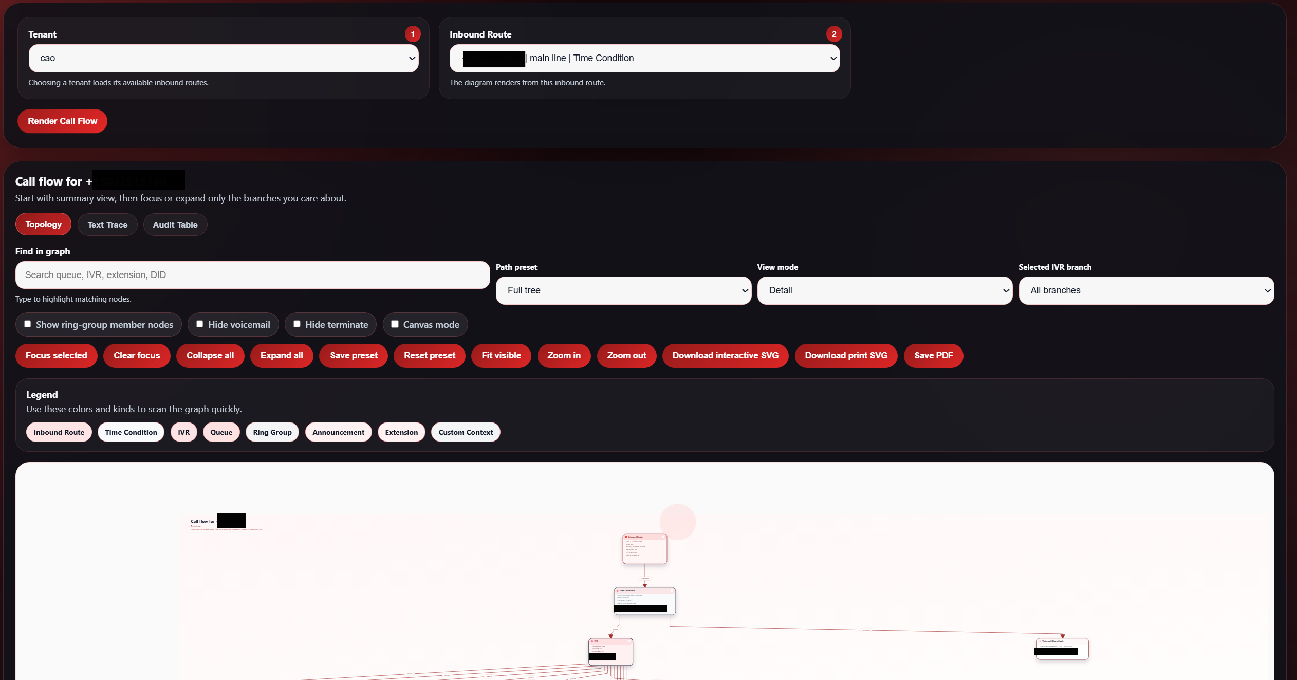
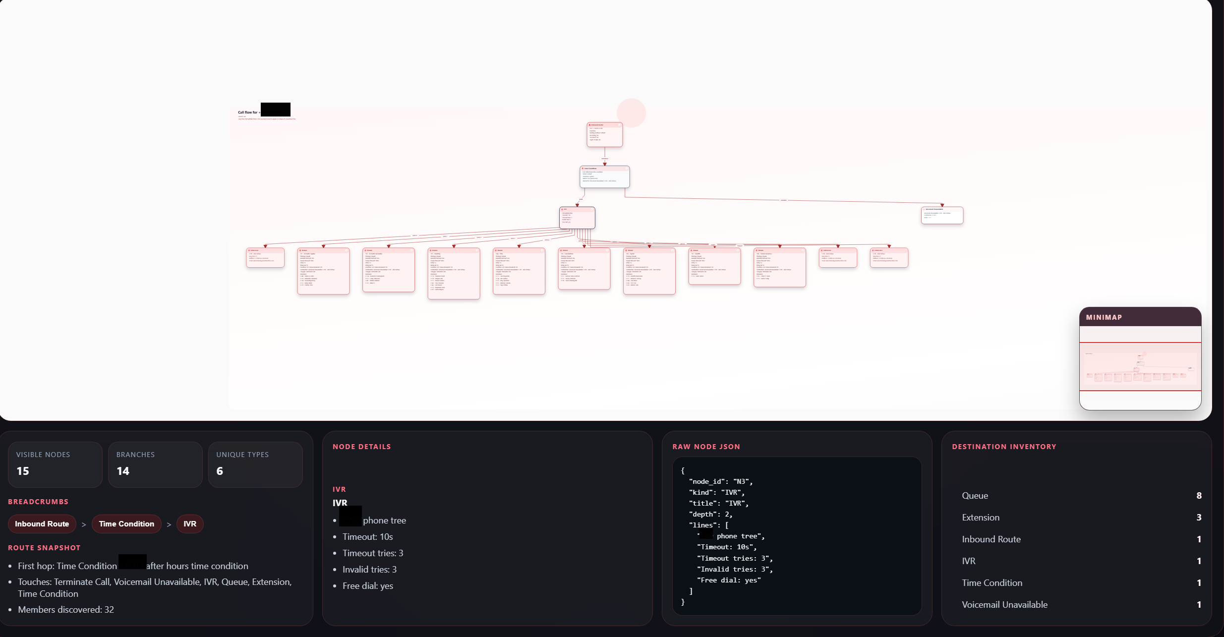
We would like to suggest a feature that would be highly useful for system integrators, technical support staff, and consultants: a built-in tool to automatically generate a visual diagram of the current PBX configuration.
Context:
Recently, while onboarding a new client, their previous provider shared a complete visual diagram exported directly from their PBX system, showing the structure and flow of calls, including IVRs, extensions, ring groups, inbound and outbound routes, and more. This made the transition process significantly easier and helped both our technical team and the client understand the full call flow at a glance.
In VitalPBX, we currently create these diagrams manually using tools like Excel or Draw.io, which is time-consuming and difficult to maintain when configurations change frequently.
Feature Proposal:
We request a new feature (or module) that would allow users to:
Automatically generate a visual diagram of the PBX configuration, including:
Extensions and their destinations
IVRs and menu options
Ring groups
Queues
Inbound and outbound routes
Trunks
Time conditions / schedules
Call routing logic and destinations
Export options, such as:
Integrated graphical view inside the web GUI
Export to Draw.io-compatible XML (.drawio), Lucidchart, PDF
Export to structured JSON, PlantUML or MermaidJS for external rendering
Automatic updates:
Option to regenerate the diagram dynamically after configuration changes
Version control or change tracking of configuration diagrams
Benefits:
Saves significant time during onboarding, auditing, and documentation
Helps communicate call flow and PBX architecture to clients visually
Reduces human errors and manual work
Greatly improves clarity for support teams working on existing deployments
This feature would be an incredible addition to VitalPBX and would help standardize and accelerate implementation processes.
Thank you in advance for considering this suggestion.